I know what you’re thinking. “It’s mid-July. It’s 1000º. Summer may never end. Where is the soccer uniform criticism we so desperately need?”
You’ll never believe what’s in store…
That’s right! Adidas went digging through soccer’s rich,1 lengthy2 history in America and found suitable inspiration to outfit 10 MLS clubs with retro kits.
Are they any good? Only one way to find out!
Uninformed Criticism
I am not exactly steeped in the tradition3 of MLS. I do not subscribe to the Apple TV+ MLS streaming package. I didn’t watch a single second of the FIFA Club World Cup that just took place all across America.
But! I ran my mouth about MLS jerseys once and by golly I will continue to do so. Let’s take a look at what Adidas got up to:
Tell you what, this collection is not half-assed. Between three collar styles and graphic treatments that are so varied, it’s sometimes hard to notice the cut-and-sew really is the same. There’s a lot to like… and some other stuff.
10. Colorado Rapids
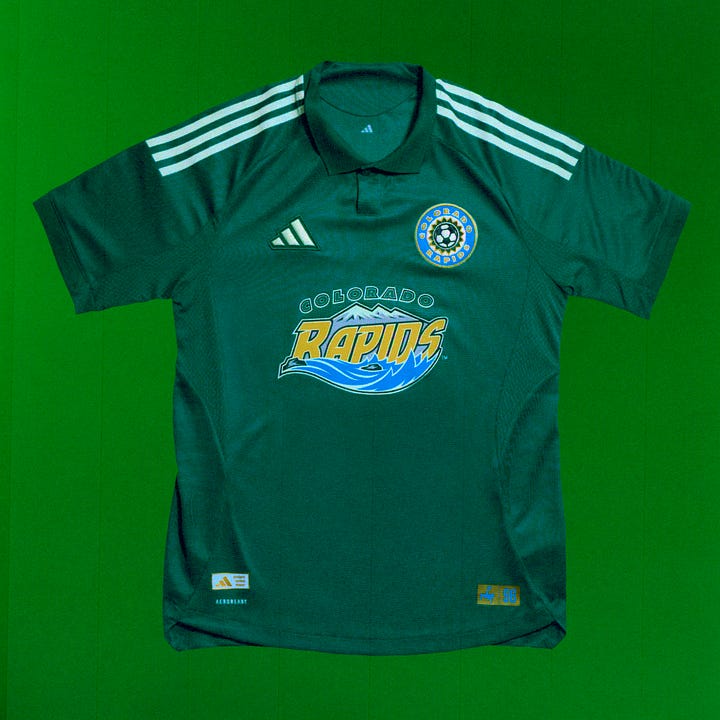
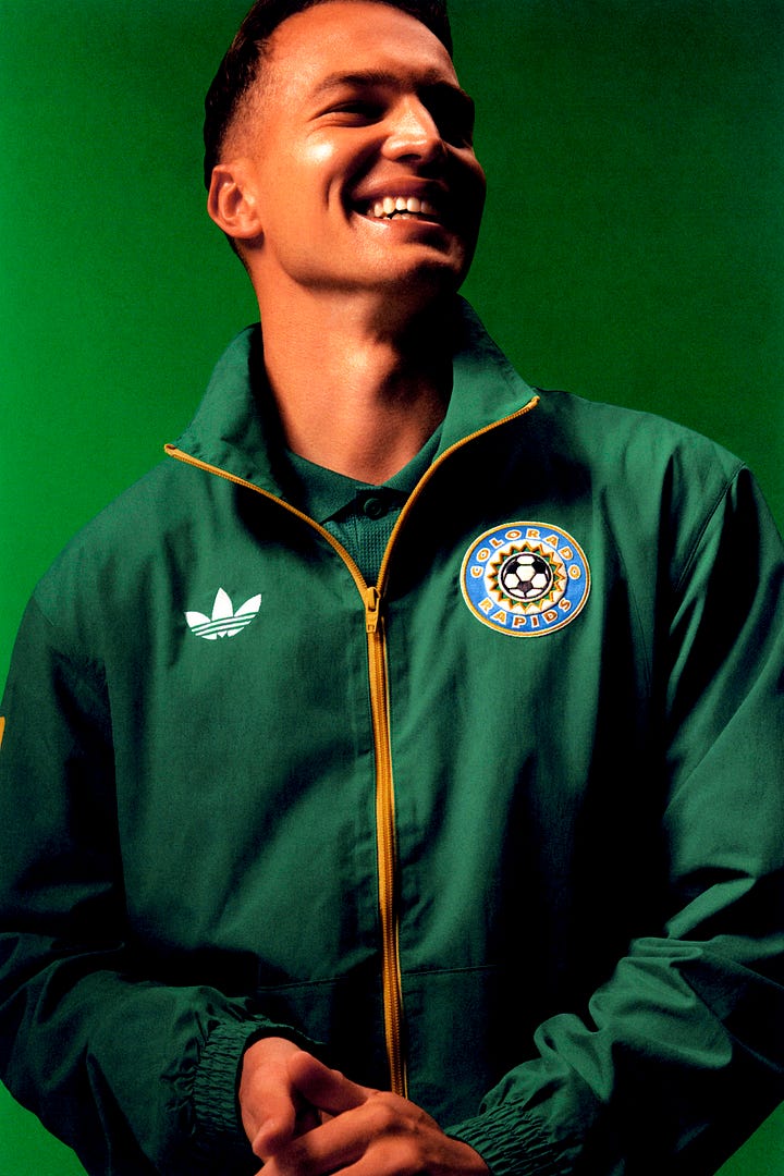
Kicking off with “just because it’s old doesn’t mean it’s good.” The Rapids are very proud of the fact they were the first club to wear green and ok congrats? The crest wasn’t good then and isn’t good now and is especially bad full-chest. A bright spot is the companion jacket showing off the snappier roundel crest4. 3/10
9. Columbus Crew
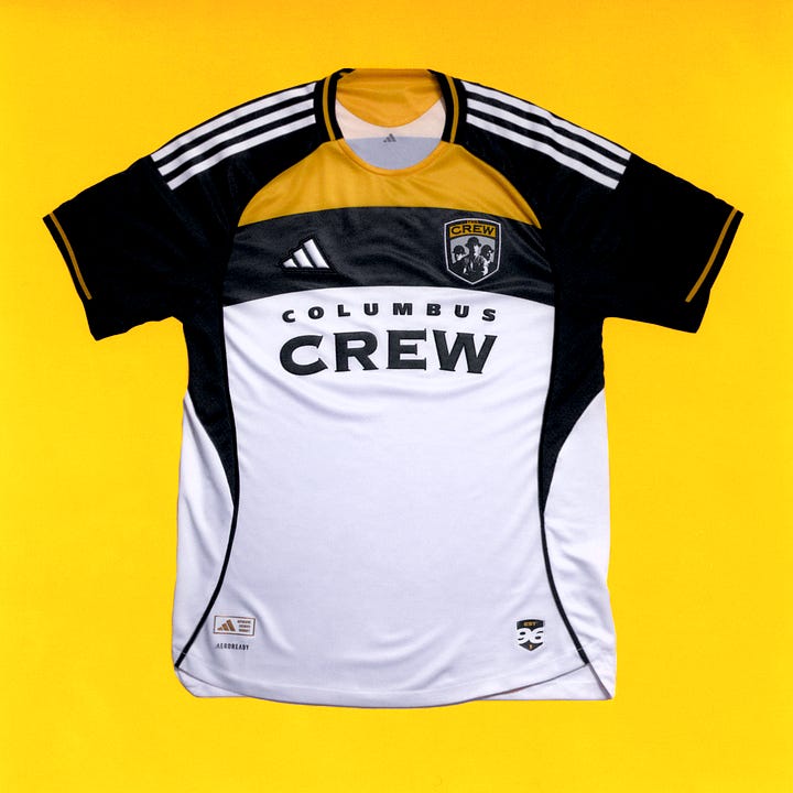
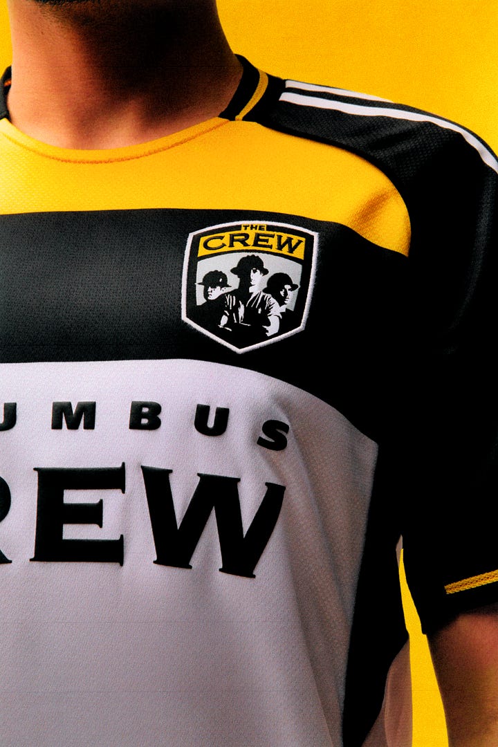
Some vague links to the inaugural 1996 jersey that feel unstuck in time. The old crest is beloved but it’s also bad. Copperplate Gothic is never the answer. Disappointing effort from one of the original clubs. 4/10
8. Nashville SC
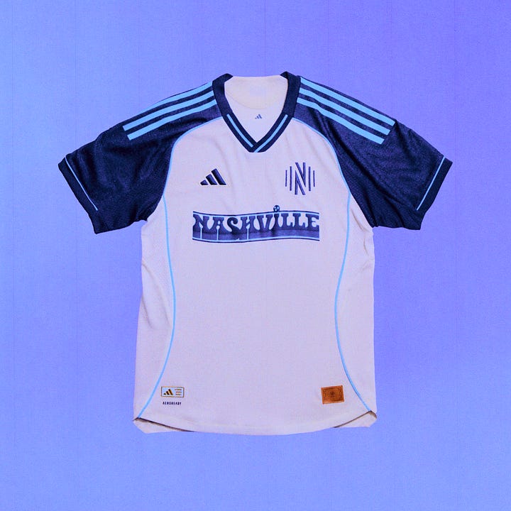

The color palette and wordmark are doing a lot of heavy lifting here. Nashville is a new club with no actual history to speak of so it was always going to be whole-cloth invention, but even grading on that curve it’s barely a pass. “Nashville” has been rendered in funky, western-ish lettering a million times but this one is especially nice and the uniform as a whole is color-blocked well. 5/10
7. DC United
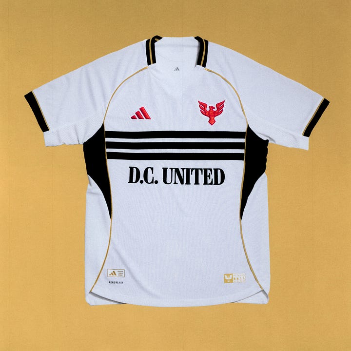
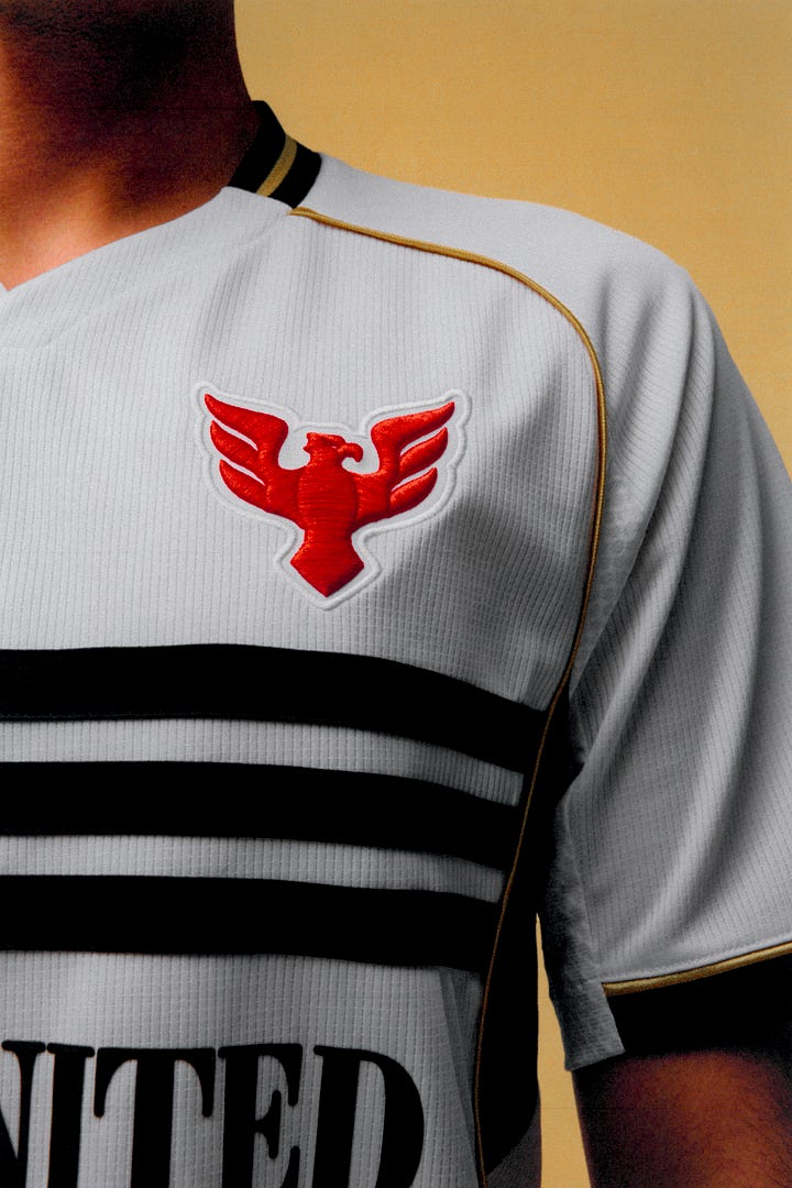
The isolated eagle makes for a nice crest but I’m not sure red was the right call on color. The red logos + black stripes + gold piping all feels a little off-kilter. Maybe Adidas is looking for an outlet after Nike took their national team? 6/10
6. Charlotte FC
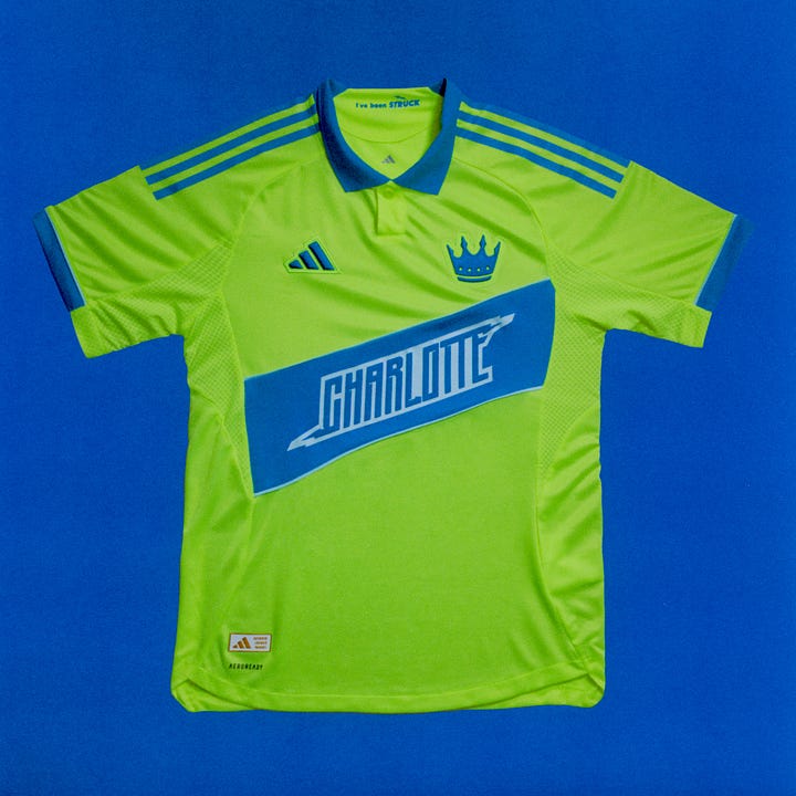
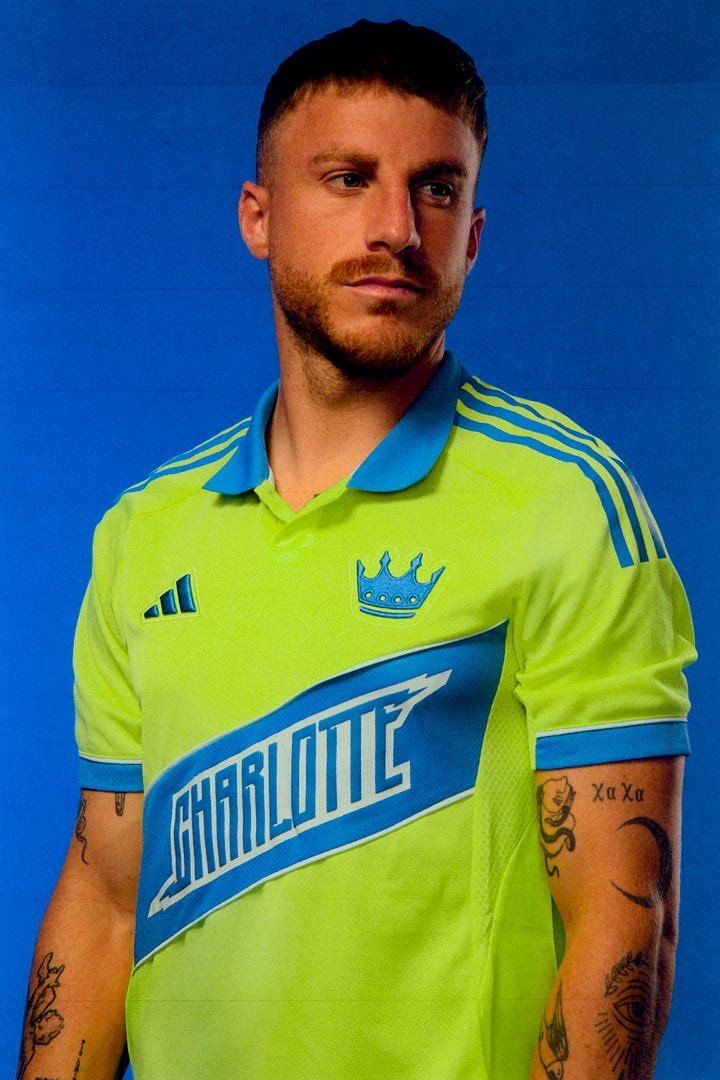
Another club where Adidas had to half-invent history5 but did so with a little more oomph than Nashville. That green is really something, and the pieced-in sash shows off the elevated materiality of the 3D-embroidered crest and overall jersey construction. It’s a bit plain but given the palette maybe safe is better than sorry. 6.5/10
5. FC Dallas
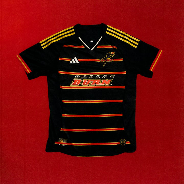
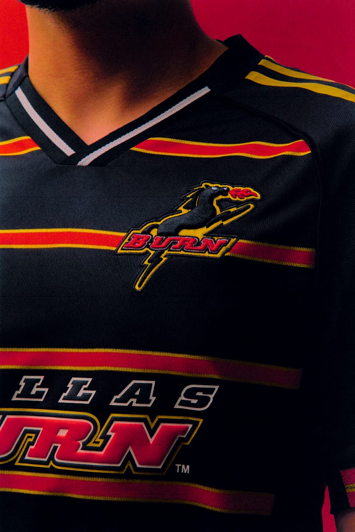
This is where we turn the corner into flat-out good and start splitting hairs on the ranking. That fire-breathing horse goes so hard and the way the BURN wordmark in the crest aligns with the red striping across the body is the kind of attention detail you just have to respect. The yellow Adidas stripes on the shoulders add some great contrast to the overall look. The whole thing feels dated but that’s kinda the point. 8/10
4. Seattle Sounders
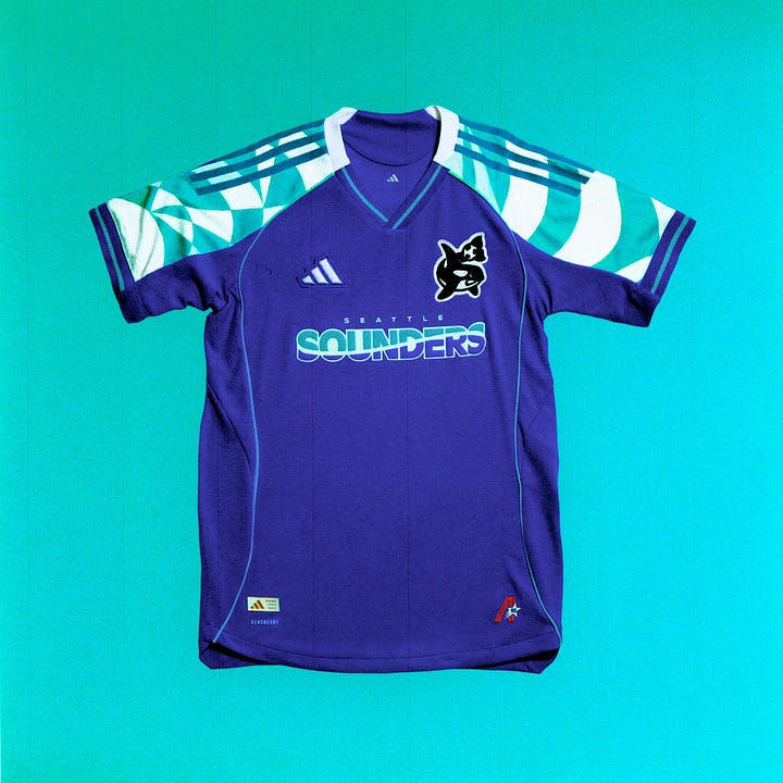

The Orca logo clears. The purple-and-teal palette is peak 90s. The wavey color blocking in the wordmark is pitch perfect, as is the shoulder pattern. Just about the only thing holding this back is the shorts and socks which don’t pack the same punch. 8.5/10
3. New England Revolution
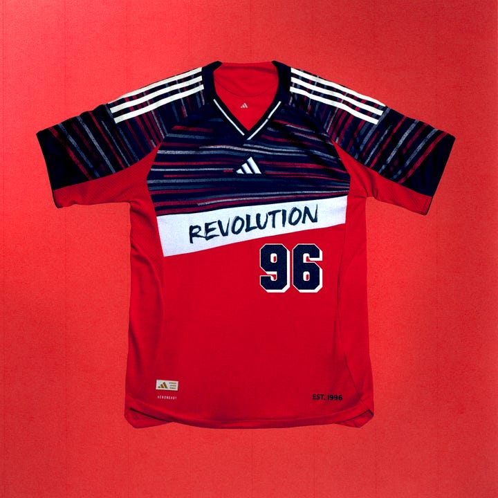
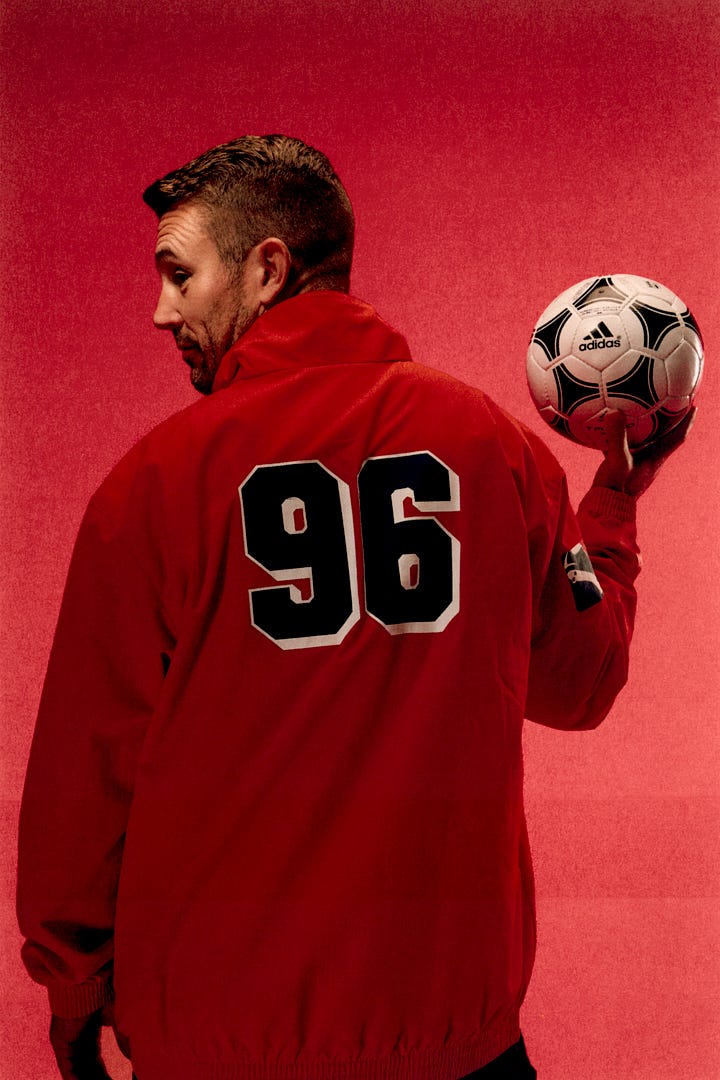
Succeeds where Columbus fell flat in linking the past and present. The drop-shadowed block numbers are great. The graphic captures the weird design history of the Revs and looks cool on its own — a tricky balance! 9/10
2. Minnesota FC
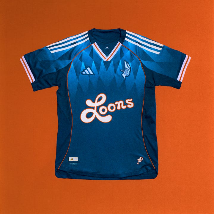
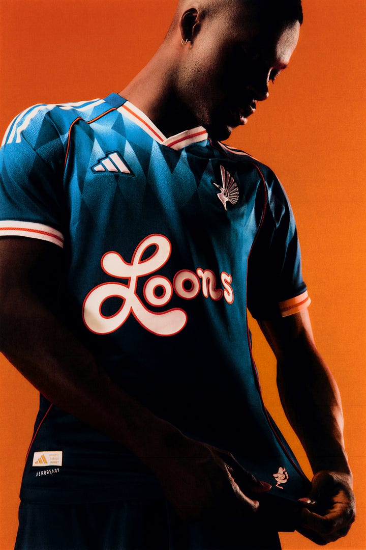
Great complementary color palette, even better print, positively delightful lettering across the chest. The intricate detail of the loon pops in the crest embroidery. Perfect. 10/10
1. San Jose Earthquakes
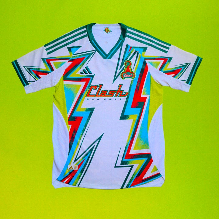
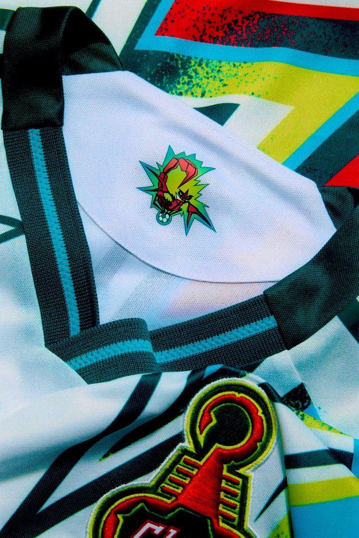
Total visual cacophony. Eye-searingly bright with pattern and texture sliders turned up to the max. A scorpion as a crest. I repeat, a scorpion as a crest. What a riot. 11/10
what?
no, you’re doing a bit
so much tradition
an original 1996 logo, no part of the maddening recent sports trend to put everything in a circle
The Carolina Lightnin played for 3 seasons in the 80s which is barely history


